Who: Retail brand with a focus on pregnancy, baby, and kids goods
By now, most of us are used to purchasing books or clothes online but with certain products making a choice can be harder, especially if you don’t know what factors to consider. A car seat for a baby most likely falls under this category as it is likely a one-time purchase with lots of specifications that you are not familiar with.
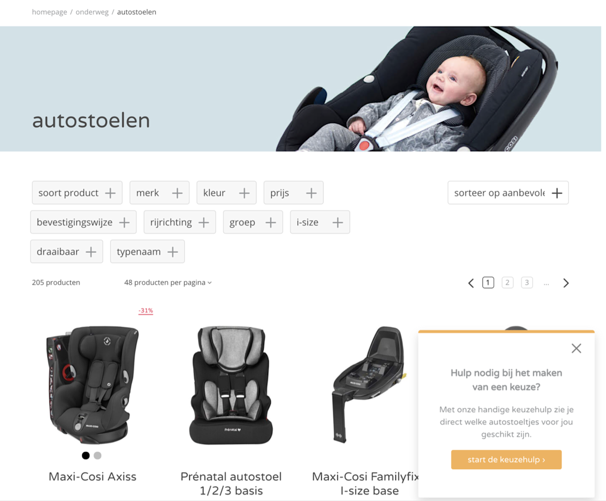
This retailer created a choice help quiz to make the process easier for its customers and to provide some guidance. This way they could alleviate some of the stress associated with making a choice and save their shoppers some time while doing so.
But to take the quiz, a visitor needs to be aware of it first, meaning it should be easily visible on the page, ideally above the fold. That way a customer is less likely to get overwhelmed and leave. To gelp with this they added a side-box that offers to help shoppers with making a choice based on their needs and a CTA button that will take them to the quiz.
Note: In order to drive more users to complete their interactive quiz, the retailer created two Unless experiences and tested which one performs better and generates the most clicks. Read the case study here.
 Side-box component promoting the questionnaire


