

Let’s take a look at how you can create a conversational user interface (UI) across your website or product, taking it further than the AI starter button often placed on the right bottom corner of a page (assuming you’ve already trained and configured your AI).
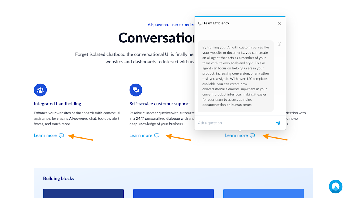
Using Unless components, you can start conversations anywhere on your website, product, checkout, and more. Below is an example from the Unless homepage where we’ve placed a conversation starter for each of the three text blocks. By clicking on these, website visitors can learn more about each subject, ask questions and get answers right away.
Types of components
Unless offers a variety of component templates to choose from. Let's start by learning about the different categories of components.
AI starter button: This is often the first AI component that comes to mind, the one we’re all used to seeing, often floating at the bottom right corner of our screens ready to be opened up with a click. Learn more about it here.
Search bar: You can add an AI powered search bar to your site which will initiate a conversation with the end user to help them find the information they are looking for. Bars can be a non-intrusive header or footer that stays visible for when the user needs it.
Popup: As the name suggests, popups appear as an additional layer on top of your page, focusing your users' attention on a single message. You can use a popup to offer a product demo, show an informative video, and more.
Sidebox: With a sidebox you can capture your visitors’ attention without interrupting their experience. They are ideal for showcasing related content and targeted suggestions, making announcements, etc.
Inline: Inline components can be inserted within existing pages between different elements, unlike overlay components which show on top of the page. Here you will find the conversation center, a larger version of the chatbot UI that you can insert anywhere on a page.
Popover: Popovers are similar to popups with the difference being that they are attached to an element on the page which you can define simply by pointing and clicking. It's a great option if you want to bring attention to a certain point in your product dashboard, highlight a new feature, emphasize an action you want users to take, etc.
Multistep: As the name suggests, multistep components are components where you can add multiple steps. They can be used to onboard users, walk them through your processes, and more. Learn more about it here.
Select your conversation starter of choice
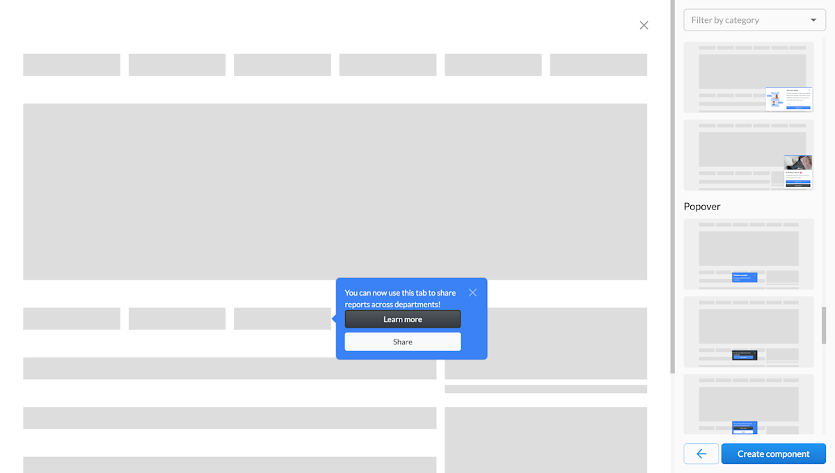
Start by navigating to the Conversation starters tab and click Create component. Here you will find many component templates to choose from. You can use the filters to view only a single type of component (ie. popups, bars, sideboxes, etc.) and click Preview to get a better look at each one. Once you've made your choice, click Create component which will bring you to the Settings page of your component.
Define the component settings
Here, you can give your component a name, define the page(s) it should appear on as well as the audience(s) that should see it. You can have a component show on a single page, multiple pages, or all pages. In the case of the latter two, you will have to choose a page for editing and previews.
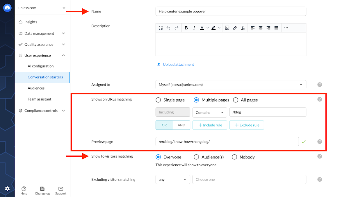
As an example, we've opted for a component to show on multiple pages and more specifically all blog pages so we've used the filter contains: /blog and set a preview page that fits the condition we defined.
There are also some advanced settings here to keep in mind. For example, it is possible to show your experience to a visitor an unlimited amount of times or to set a maximum number.
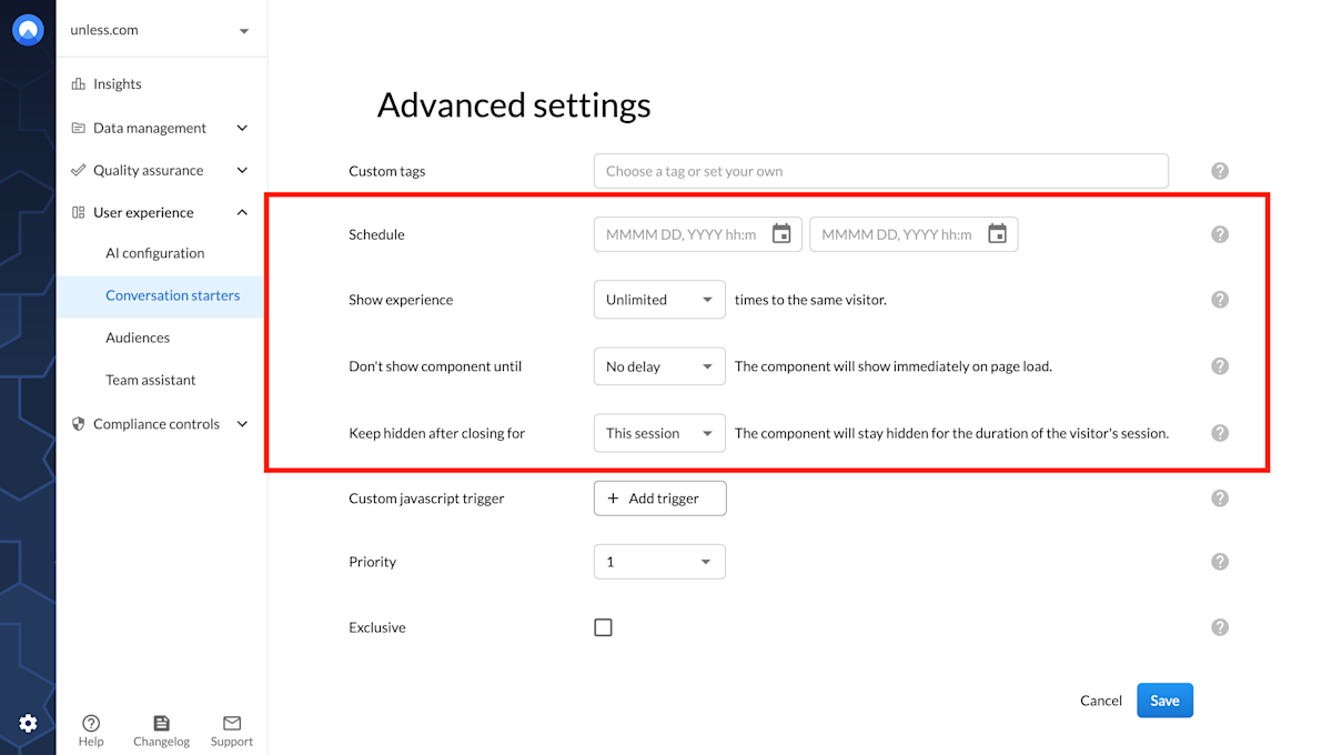
Additionally, when it comes to an overlay component, you can define when the overlay is shown (no delay, time on page, scroll distance, or exit intent) and how long it remains hidden after a visitor interacted with it (ie. closed the overlay or clicked the CTA button).
Adjust your component in the editor
Once in the editor, you will see a number of tabs on the right. The best approach here is to click through each one (after switching on Expert mode under the Other tab) to see all the available settings. We will go through a number of them in this article but there are many more adjustments you can make in the editor.
The first thing to decide on is the positioning of your component via the Layout tab. If it's an overlay, it will already be visible when you open the editor and you can choose whether to show it on the right, left, top, bottom, etc. If it's inline or a popover, using the radar icon, you select an element it should appear in relation to. Make sure to Save as draft to see your changes reflected visually.
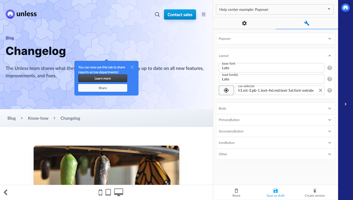
The next step can be the content and visuals so if there's a field for a header or body text, you can fill these in. If there's an image or a video attached, you can add/change them.
Then it's time for the buttons (primary and optionally secondary) where we define what they are for, what we want to happen when a user interacts with them, and so on.
Starting at the primary button tab, if you want conversational functionality, you can start by inputting a conversation name. This name will show up on top of the chatbox to provide context to the reader. Additionally, each conversation is stored in your account and you can spot a conversation easily via the name it is listed under.
One of the things that set these components apart from a chatbot is that the user doesn’t have to start the conversation by asking a question first. The component acts as a conversation starter that you can place across a UI to initiate dialogue.

In the example above, we've added a prompt for the AI to respond to, meaning no initial input is needed from the user to start an interaction (other than clicking on the button). We've also opted to show a chat icon in the button to signal the possibility to start a chat.
This could be all you want to set up. Optionally, you can make use of a secondary button, maybe with an action attached to nudge the user further in their journey. Actions can include contacting support, showing a video, and much more.
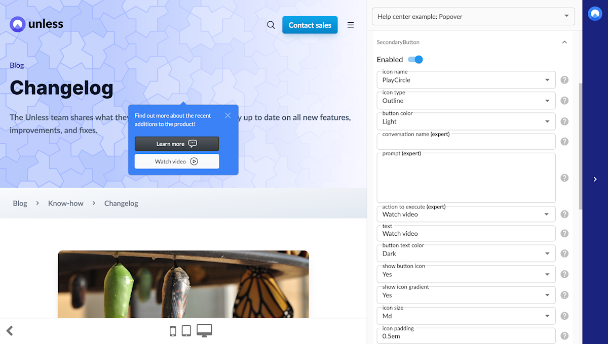
In the example above, we've opted to show a video to the user so we adjusted the button text and the icon accordingly and attached an action to execute. This time we've left the conversation name and prompt empty as that isn't the interaction we're looking for with this button.
Set your component live
Once you are done, you can save your experience as a draft, and create version and publish. You can then go back and preview the experience, making sure it looks and works the way you want it to. When it's ready to go live, make sure you click Start experience on the Settings page of your component!
That’s it! You can now go ahead and create your own conversational UI components.